
Approve logo printing and Pantone colours before production. Learn how to control artwork versions, placement, substrates and physical samples.
LINKORA SOURCE · FIELD GUIDE
Approve the physical print
Artwork
Version and print method
Position
Size and measured placement
Colour
Physical reference on the substrate
Approval
Named approver and retained proof
Freeze the artwork before judging the sample
The approval record should identify the actual file used, including its filename or version, not simply say that the logo was approved. Vector artwork is normally needed for clean separation and scaling, while each decoration process has its own limits on line weight, small text and colour count. Record the finished logo width and height, its distance from a seam or product edge, its orientation and the printable area. A photograph with no measurements proves that a sample existed; it does not tell production where the mark belongs.
- Named artwork version and decoration process
- Finished dimensions, orientation and measured position
- Supplier confirms any process limit before making the sample
A Pantone reference is a target, not a guarantee
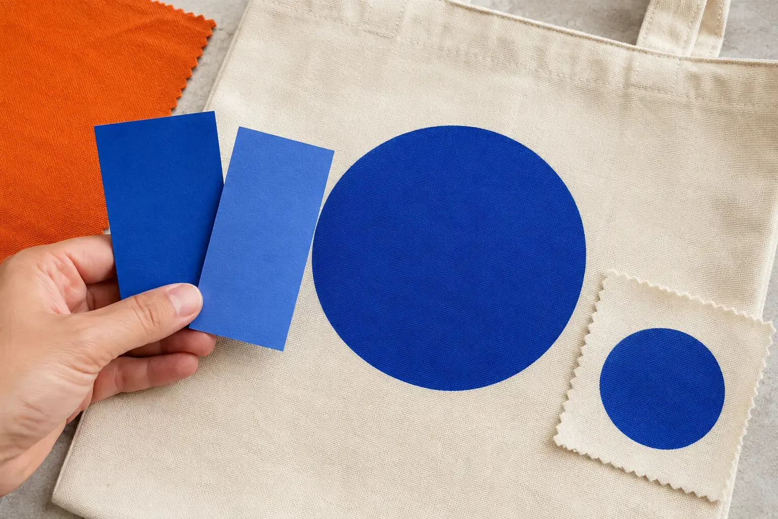
The same colour behaves differently on coated metal, dyed fabric, absorbent paper and a transparent plastic. A Pantone number gives the parties a common target, but substrate, base colour, ink system, surface finish and lighting affect the result. Where brand colour is critical, approve a physical decorated sample on the real product or substrate and retain it as the production reference. A photo or monitor view can help communication, but screens are not calibrated production standards and should not carry final colour approval alone.
- State the colour system and exact reference, not only a colour name
- Approve on the actual substrate and finish where colour is critical
- Keep the physical approved sample for production and inspection comparison
Approve every process combination that will be produced
A logo approved as a screen print on one bag does not approve embroidery on a cap or laser marking on a bottle. Each product, substrate and decoration method is a separate production combination. The approval table should show the sample version, date, approver and any accepted limitation for each combination. At inspection, placement, visible colour, registration, adhesion or stitch quality can then be checked against a fixed reference; where no physical reference exists, the report should say so rather than imply a precision the evidence cannot support.
- One approval record per product, substrate and decoration method
- Date, approver and accepted deviations written beside the sample version
- Inspection checklist names placement, appearance and process-specific defects
Authoritative references
Need this applied to your sourcing brief?
Tell us the product, market and decision you need to make. We will confirm whether a scoped sourcing, verification or quality service is suitable.
Start a sourcing brief